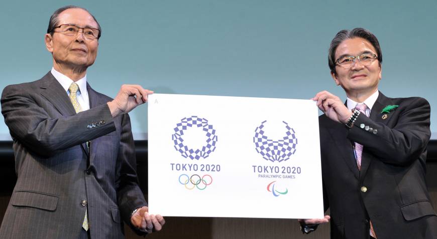
Checkered pattern by artist Tokolo chosen as logo for 2020 Tokyo Olympics
The Japan Time Apr 25, 2016

Tokyo 2020 Olympics organizers on Monday chose logo A — a stark indigo-and-white checkered circle — as the games’ replacement emblem after the original design was scrapped last year amid claims of plagiarism.
The Tokyo 2020 Logo Selection Committee chose the logo from a shortlist of four following a competition open to any resident of Japan aged over 18. Almost 15,000 entries were submitted.
The winning logo was designed by Asao Tokolo, a 46-year-old artist whose works have featured in several exhibitions and who graduated in architecture from Tokyo Zokei University.
“I was thinking of something like a coloring picture that everyone can add their own color to,” Tokolo said. “White against indigo blue — it’s a very clean-cut expression. The games will also be held during summertime and I wanted to add some coolness into my design.”
The design comprises 45 interconnecting pieces forming a checkered pattern known as ichimatsu moyou. Use of the color indigo is intended “to express a refined elegance and sophistication that exemplifies Japan.”
“The committee found this checkered pattern to be very simple and we can feel the refined sophistication of the Japanese tradition,” said Logo Selection Committee Chairman Ryohei Miyata.
“On the other hand, there were people who said it was understated or it made their eyes flash,” he said. “I very much hope that the emblems will prove popular with people everywhere, and we look forward to your continued support toward the Tokyo 2020 Games.”
The Logo Selection Committee, featuring members drawn from the worlds of sports, design and business, held a vote Monday morning before presenting its recommendation to the Tokyo 2020 executive board for final approval.
Tokolo’s design received 13 votes, while logo B had one, logo C two and logo D five. The winning logo was unanimously approved by the executive board.
“Since Sept. 11, 2001, I started a particular concept,” Tokolo said. “There was a big disconnect in the world because of terrorism so I wanted to connect things. This design is based on a similar philosophy.
“I can’t be an athlete, but this was something I could get involved in. I always dreamed of that as a child.”
Tokolo will be awarded ¥1 million and a ticket to the opening ceremonies of both the 2020 Olympics and Paralympics.
The logo competition was launched last October after the original logo by designer Kenjiro Sano was scrapped. The designer of a Belgian theater logo claimed Sano had plagiarized his work.
“During this process we have tried to convey as much information as possible in order to be as transparent as possible,” said Miyata.
He bristled at suggestions that the selection committee had already made up its mind before the 10-day public consultation process began.
“We didn’t start with Plan A in mind,” he said. “That was not the process and we were irritated by this report. We worked with the best sincerity so as not to be subjected to these kind of comments. Everybody spoke their minds and then we went to the voting process.”
The Logo Selection Committee chose a shortlist of four designs and four backups in January before subjecting them to rigorous copyright checks. One of the designs on the original shortlist failed to clear the copyright checks and was subsequently dropped.
The committee also invited members of the public to voice their opinion on the shortlist following its April 8 unveiling.
“This time the big theme was participation,” said Tokyo 2020 Chief Executive Officer Toshiro Muto.
“This logo selection process was the first of its kind. For us it was a challenging project, but I think it could serve as a model for future selection.”
The committee received opinions from 39,712 members of the public online and an additional 1,804 comments written on postcards.


